Custom Channel Letter Sign Brings Core Innovations Pilates to Life
The best signage does more than help people find your business. It helps them understand it. When Core Innovations Pilates & Fitness needed exterior branding that matched the experience inside their studio, our team designed and installed a custom front-lit channel letter sign that captures their clean, welcoming, and professional atmosphere before a single member walks through the door.
Why Fitness Studio Signage Should Never Be One-Size-Fits-All
Fitness is personal. A powerlifting gym, a yoga collective, and a Pilates studio all serve different people with different expectations. Yet many fitness businesses settle for generic storefront signage that could belong to anyone. That is a missed opportunity. Your sign is the first workout your brand ever does, and it should perform.
Core Innovations built its reputation on a refined, approachable, modern experience. Their members expect calm and precision, not noise. So the signage had to communicate that same feeling from the parking lot. At Charlotte Sign Studio, we believe great signage starts with understanding the brand. Before we ever discuss materials, lighting, or fabrication, we ask a simpler question. What should someone feel when they see this building?
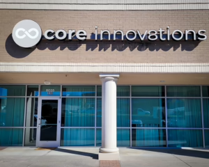
For Core Innovations, the answer was clarity. Clean letterforms. Balanced spacing. A distinctive round logo cabinet anchoring the brand mark. Every choice in the sign design process flowed from that single idea.
What Makes Front-Lit Channel Letters the Right Choice
Channel letters are the workhorse of professional business signs in Charlotte, and for good reason. Each letter is an individually fabricated, three-dimensional element mounted directly to the building facade. The result reads as permanent and established, not temporary or budget-driven. For a wellness brand, that perception matters. People trust businesses that look invested in their space.
Channel letters: Individually built, three-dimensional letters, usually made from aluminum with an acrylic face, that are mounted separately onto a building rather than printed on a single flat panel.
We chose a front-lit configuration for Core Innovations. In this style, light shines forward through the translucent face of each letter. During the day, the letters present crisp, dimensional branding against the brick facade. After dark, they glow with even illumination that keeps the studio visible to evening traffic. Since many Pilates clients attend classes before sunrise or after work, that around-the-clock visibility is not a luxury. It is a business requirement.
Front-lit: A lighting style where LED modules inside each letter shine outward through the letter face, making the letters themselves appear to glow at night.
Here is an insight most sign buyers never hear. Nighttime legibility is often won or lost in the spacing, not the lighting. Illuminated letters visually expand at night as light halos around each character. Letters spaced for daytime reading can blur together after dark. Our team accounts for that glow effect during design, which is one reason our LED signage stays sharp in both conditions.
Designing Exterior Branding That Complements the Building
A storefront sign never exists in isolation. It lives on a facade, next to neighboring tenants, above windows, and within sightlines shaped by parking lots and roadways. The Core Innovations storefront features light brick, large glass panels, and a classical column at the entrance. Loud colors or oversized graphics would have fought that architecture. Instead, the neutral letterforms and circular logo cabinet complement the building while still standing out clearly against the masonry.
This is where our brand-first approach separates a true sign partner from a print shop. We studied how the Core Innovations mark, an infinity-style symbol, would translate into a fabricated cabinet at architectural scale. We considered how shadows would fall across the dimensional letters at different times of day. We evaluated the sign band height so the branding would sit naturally within the facade rather than looking bolted on as an afterthought.
Getting those details right requires coordination between design, manufacturing, and installation teams working from the same plan. Because we handle all three under one roof, along with project management from first sketch to final inspection, nothing gets lost in translation between vendors.
Professional Installation Makes the Transformation Complete
Fabricating a beautiful sign is only half the job. A flawless sign installation is what turns components into a storefront transformation. Channel letter installation demands precision. Each letter must be leveled, aligned, and secured to the facade, with electrical connections routed cleanly behind the wall so no conduit or wiring distracts from the finished look.
Our installers also verify illumination consistency before we call a project done. Uneven brightness between letters is one of the most common failures we see on signs installed by less experienced crews. It is subtle during the day and glaring at night. For Core Innovations, we confirmed even light output across every character and the logo cabinet, so the sign presents one unified glow rather than a patchwork.
The finished result speaks for itself. By day, the storefront reads as polished and professional. By night, the illuminated branding turns the studio into a landmark on its stretch of road. That is the completed transformation you can see in our project video, and it is the standard we bring to every outdoor sign we produce.
What Fitness and Wellness Businesses Can Learn From This Project
If you own a gym, studio, spa, or wellness practice, the Core Innovations project offers a simple lesson. Your signage should match your service experience. Research from FedEx found that roughly three quarters of consumers have entered a store they had never visited before based on its signage alone. First impressions form fast, and your storefront makes yours for you, whether you designed it intentionally or not.
Start by defining the feeling you want to create, then let that feeling drive every decision about letters, lighting, color, and placement. If you are unsure where your brand lands, our team walks clients through that discovery as part of every signage service we offer, and our project gallery shows how differently that thinking plays out across industries.
Ready to Transform Your Storefront?
The Core Innovations project shows what happens when signage strategy, thoughtful design, quality fabrication, and expert installation come together. One sign changed how an entire storefront communicates, day and night. Your business deserves the same level of intention.
Whether you need illuminated signs, channel letters, or a complete exterior rebrand, Charlotte Sign Studio is ready to bring your vision to life. Contact us today to request a free quote and start your own storefront transformation.
Back